
 @itaysk
 itaysk
 itaysk
Intuitive vs. Productive UX
In my opinion intuitivity and productivity are two factors of a successful user experience design that are almost mutually exclusive. Intuitive means that the users can quickly and easily learn how to work with the software. Productive means that the user can work as efficiently as possible with the software, getting more done with minimal effort.
I think of it like a slider, where in one side you have productive design, and on the other side intuitive design.

I’m not a UX\UI expert, but I have some experience working with people on product planning, and this point is always surfaced. I don’t think I have discovered it, or solved it. I merely recognize and name it.
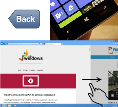
For the sake of this post I will use as an example something that is ubiquitous and familiar – navigating backwards within an app. An intuitive solution might be to have a left facing arrow shaped button that contains the name of the previous screen (This is similar to the iPhone UI). A Productive solution might be to use a fixed hardware button to go back (This is similar to the Windows Phone UI). An even more productive UI will be to have the user swipe from left to right in order to navigate back (This is similar to IE on Windows 8).
The point is that neither of these solutions is both super productive and super intuitive at the same time. There has to be some tradeoff, and each is located differently on our Productivity\Intuitivity slider
Let’s take just 3 factors and examine each solution by each one of those factors:
- Screen real estate – How much space the solution takes from the screen. Less is better, and more productive because it allows more content in the screen.
- Learning about the function – How easy it is for a first time user to know that your software has this function, and to learn how to use it. Easier is better, and more intuitive because it takes less time for a user to learn how to use your program.
- Using the function – How fast it is for a user that is already familiar with the feature to invoke it. Faster is better, and more productive because users can operate the software efficiently and get more done.
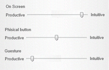
We will scale each solution for each factor with 1-5 rank where 1 is better according to the description above.
| Parameter | On-Screen | Physical | gesture |
|---|---|---|---|
| Screen space | [4] | [3] Not instead of other UI | [0] No screen space at all! |
| Learn about | [2] Arrow shape and prev. screen text helps. Good location with other navigation controls | [3] Arrow shape helps. Detached from other navigation controls. Modern idiom. | [5] Impossible to learn without an explicit a hint or training! |
| Using | [3] Location and appearance might change in apps. Tapping is a basic gesture. | [3] Always there. Outside of comfort zone, hard to reach. Repeatable action, “muscle memory”. | [2] Swiping can occur anywhere. Can be done blind fully. Swipping is not a basic gesture. |
I have been clinging on the backward navigation example just to make my point, but this is applied to almost everything. The principle is that you always have to think about where to place the slider between intuitive and productive design. I was recently involved in a discussion around an app that has a single major use case for the UI which is a map with some controls on it. The controls were grouped into three collapsing menus that always appeared on top of the map and showed icons that represent the action. Some folks suggested that this design was not intuitive enough, and that a user won’t know that he needs to expand the menus, and even then that the user won’t be able to tell what the icons meant. They wanted a different kind of UI that was easier to understand. The other group tried to keep the UI as minimal as possible to leave as much space for the map itself (which is the major element in this app). This was a classical Intuitive vs. Productive debate. Of course a first timer will have to stare at the screen for a while before realizing what to do. Also some trial and error learning is expected. On the other hand once the user is accustomed for the app, he probably wants as little distraction as possible, being able to perform tasks faster.
My suggestion is to start with intuitive and then transition to productive. That can be in the form of having the menus expanded by default, or add tutorial for first time users. Maybe have a setting that allows advanced users get counter productive (but intuitive) stuff out of the UI.
Another example is the App Bar in Windows Phone 8, that shows only the icons for the most usable actions. When opened it will show their description and other actions. So the first time I get to know an app I will open the app bar and see what every button do. But when I am using the app as a daily tool I just blindly click the icon. I don’t know if it’s a design goal, but it fits my purpose here.

Another place where this is extremely recognizable, is with the new UI of Windows 8. I think that the UI of Windows 8 is very productive, but no so intuitive. The main cause is that windows 8 relies too much on gestures. The most fundamental activities in an OS like showing settings, navigating inside an app, switching between apps, and so on – all of this is done by swiping from the edges. This is very productive once you get use to, but you do have to get use to it…